
Keyboard Navigation Is the Accessibility Feature Developers Ignore
Most of us build and test interfaces with a mouse. It’s fast, intuitive, and it works well for us.
But here’s the part we often overlook.
Not everyone uses a mouse.
For many users, interacting with a product happens entirely through a keyboard, sometimes combined with assistive technologies like screen readers. When keyboard navigation is not properly supported, the experience does not just become inconvenient. It can become difficult or even unusable.
What makes this tricky is that these issues often go unnoticed. Everything looks fine visually. But the moment you remove the mouse, the cracks start to show.
The Moment That Changes Everything
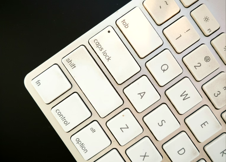
If you have not done this before, try it once:
- Open your application
- Put your mouse aside
- Start navigating using only the keyboard
Use:
Tabto move forwardShift + Tabto move backwardEnterto activate elements
Within seconds, you will likely notice:
- Focus jumping unpredictably
- Elements that cannot be reached
- Modals behaving incorrectly
- No visible indication of focus
This simple exercise reveals an important truth:
Keyboard accessibility is not automatic in most interfaces. It has to be intentionally built.
What Keyboard Navigation Really Means
Keyboard navigation ensures that every interactive part of your interface can be used without a mouse.
At a minimum, users should be able to:
- Move through elements in a logical order
- Understand where they are on the page
- Interact with controls such as buttons, links, and inputs
- Navigate complex UI like menus, modals, and tabs
This is not an advanced feature. It is a fundamental expectation.
When keyboard navigation is not properly supported, the experience does not just become inconvenient. It can become difficult or even unusable.
Where Things Usually Go Wrong
Most accessibility issues do not come from bad intentions. They come from small decisions that seem harmless at the time.
A common example is removing focus outlines during styling. While it may make the UI look cleaner, it removes a critical visual cue keyboard users rely on to know where they are.
Another frequent issue is relying on non-semantic elements. A clickable <div> might work perfectly with a mouse, but it does not provide keyboard support by default. Native elements like <button> already handle focus, keyboard interaction, and accessibility roles. That is why they should be preferred.
Tab order is another subtle but important area. Developers sometimes try to control navigation using tabindex, but this often leads to unpredictable behavior. Users expect navigation to follow the natural structure of the page. Breaking that expectation creates confusion.
Modals are also a common source of issues. If focus is not moved into the modal when it opens, and kept within it, users can end up interacting with content behind it. This breaks the experience.
Custom components add another layer of complexity. Dropdowns, tabs, and sliders often look great visually, but without proper keyboard handling, they become inaccessible.
What Good Keyboard Accessibility Looks Like
The good news is that building accessible keyboard interactions does not require reinventing everything. In many cases, it is about using the platform correctly.
Some key practices that make a big difference:
- Use semantic HTML such as
button,a, andinput - Ensure focus is always visible and easy to identify
- Maintain a logical tab order based on DOM structure
- Manage focus properly in modals and overlays
- Support expected keyboard interactions such as Enter, Space, and Arrow keys
- Provide skip links to bypass repetitive navigation
When these are in place, the interface becomes predictable and usable.
Testing Without Overthinking
One of the best things about keyboard accessibility is how easy it is to test.
You do not need advanced tools to get started. Just use your keyboard.
Try navigating your application and ask yourself:
- Can I reach every interactive element?
- Can I clearly see where focus is?
- Can I complete important tasks without getting stuck?
This simple habit can catch a surprising number of issues early.
Tools can help validate your work:
- Lighthouse in Chrome DevTools
- axe DevTools
- WAVE
- Screen readers such as NVDA and VoiceOver
But manual testing is where it begins.
Why This Matters More Than We Think
Keyboard accessibility is not just for a small group of users.
It supports:
- Users with motor impairments
- Screen reader users
- Power users who prefer keyboard navigation
- Anyone using alternative input devices
More importantly, it reflects the overall quality of your product.
When keyboard navigation works well, it usually means:
- The structure is sound
- The semantics are correct
- The interactions are predictable
It is a sign of good engineering.
A Developer’s Take
Accessibility is much easier to get right early than to fix later.
Keyboard support is not something you can bolt on at the end. It needs to be considered while designing components and writing code.
It is not about extra effort. It is about making better decisions from the start.