

Accessibility in the Design Process: Color Considerations
At Ally, we believe design is only successful when it works for everyone. Accessibility isn't just a feature or a final checklist—it’s about removing barriers so every user feels welcome and empowered.
Accessibility supports people with visual, hearing, motor, and cognitive disabilities and helps in everyday situations. Your speakers stop working. You sprain your wrist and can’t use a mouse. You’re reading your screen in bright sunlight. When we design with these realities in mind from the start, our products are more usable for all.
Designing for everyone means catching and fixing obstacles early. In this article, we focus on how color choices affect accessibility, with an emphasis on contrast and readability.
Why Color Accessibility Matters
Color breathes life into design. It sets the mood, shapes your brand’s personality, and communicates meaning at a glance. But when colors or contrasts are hard to see, that meaning can slip away unnoticed.
Roughly 1 in 12 men and 1 in 200 women have color blindness. The most common type, deuteranopia, affects approximately 6% of men and causes reds, greens, and oranges to appear more similar or yellowish.
Selecting accessible colors invites everyone to connect with your content. When contrast and color work for all, your designs become more welcoming and reach a wider audience.
Where Color Accessibility Fits in the Design Process
Build color accessibility into every stage of the project.
- Brand and palette definition
- Component and layout design
- High-fidelity visual design
- Design handoff and development
- QA, testing, and iteration
At Ally, we check color contrast early and keep checking it often. These checks are part of design reviews, code reviews, automated tests, sprint reviews, and QA steps. Finding problems early means less rework and better results.
Core Color Contrast Guidelines
Strong contrast makes content easier to read for everyone.
Use these minimum contrast ratios:
- Normal text: at least 4.5:1
- Large text: at least 3:1
- Icons, graphics, and UI components: at least 3:1
Make contrast checking second nature by using tools like Stark, Figma plugins, or the WebAIM Contrast Checker as part of your daily workflow.
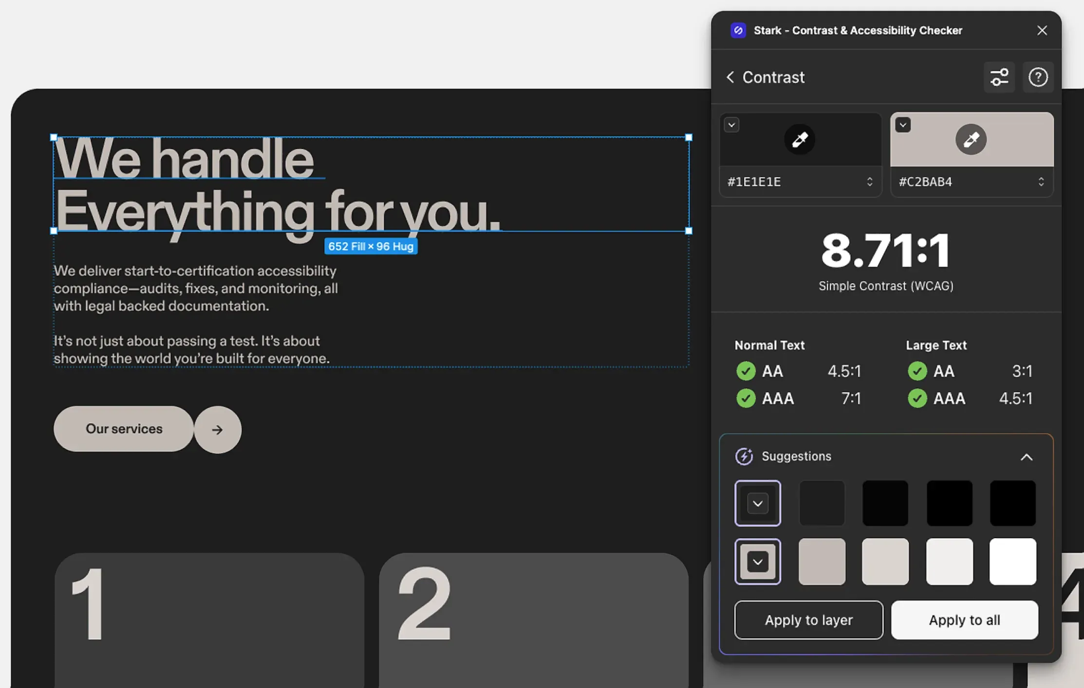
AA vs. AAA: Understanding Accessibility Standards
The Web Content Accessibility Guidelines (WCAG) set standards to make digital content easier to use for people with disabilities and anyone in challenging conditions. The World Wide Web Consortium maintains these guidelines.
Level AA
- 4.5:1 contrast for normal text
- 3:1 for large text, graphics, and UI elements
Most organizations set their sights on this standard, as it’s recognized and trusted across industries.
Level AAA
- 7:1 contrast for normal text
- 4.5:1 for large text
This level takes readability even further and breaks down more barriers, but isn’t always required.
Designing for Readability in Real-World Conditions
High contrast keeps text crisp and easy on the eyes, whether you’re reading for hours or glancing at your phone in bright sunlight or a dimly lit room.
Prioritizing readability ensures your content stays clear and user-friendly, no matter where or how it’s viewed.
Gradients, Images, and Transparency
Text placed over gradients, background images, or semi-transparent layers must still meet contrast requirements.
- Check the lowest-contrast areas first
- Test designs at different screen sizes
- Verify contrast when users zoom in
Visual complexity should never reduce legibility.
Clustering Elements and Maintaining Contrast
Clustering related elements helps users see how actions and content connect. It makes it clearer what belongs together, especially for people using assistive technology.
Examples
Grouped buttons:
Each button must have a 3:1 contrast ratio with the page background. Button text must meet text contrast requirements.
Navigation menus:
Menu items must have sufficient contrast with their background, and text must meet text contrast ratios.
Form fields:
Form field borders need at least a 3:1 contrast ratio against surrounding backgrounds.
Groups of elements should be easy to spot on the page, not just within the group itself.
When we make accessible color choices from the start, we create designs that are more readable, more usable, and more inclusive for everyone.
Don’t Rely on Color Alone
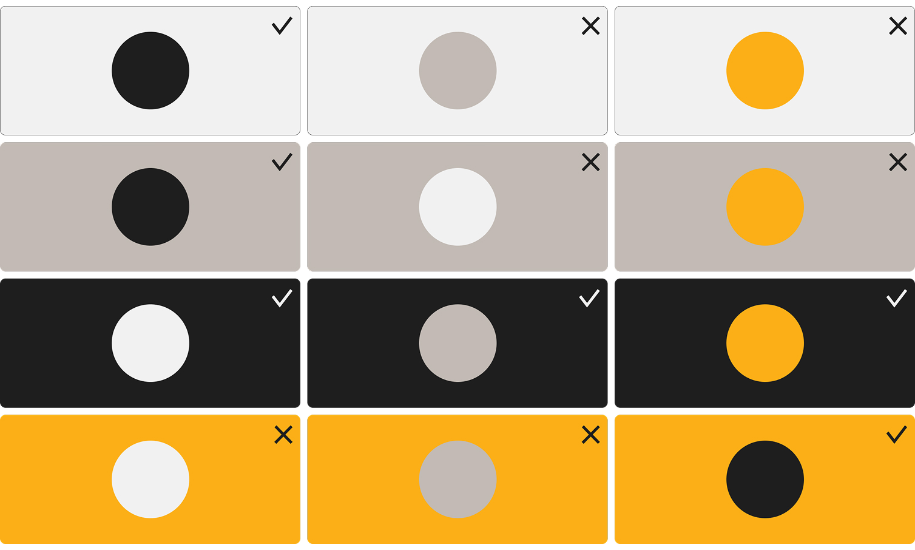
Never rely on color alone to get your message across, because not everyone perceives color the same way and some users may not perceive it at all.
To make meaning clear:
- Add text labels
- Use icons and symbols
- Incorporate patterns or textures
- Vary shapes and line styles
For example, instead of using just red and green, add icons or labels like a checkmark and the word “Success.” In charts, use dashed or dotted lines along with color.
Inactive User Interface Components
Inactive components don’t need to meet contrast requirements because they aren’t available for interaction. For example, a disabled submit button may appear faded until all required fields are complete. This follows WCAG guidance. However, it should still be perceivable and users must be given clear instructions on how to enable it.
Building Accessibility Into Team Collaboration
Accessibility is a shared responsibility.
- Designers: review designs with accessibility in mind
- Developers: add accessibility checks to the coding process
- Project managers: include accessibility goals in timelines and milestones
Set clear goals, assign ownership, and review progress regularly. When accessibility is part of every stage, it becomes part of how we work — not an extra step.
Color is only one part of accessibility, but it’s one of the earliest and easiest decisions to get right. When we make accessible color choices from the start, we create designs that are more readable, more usable, and more inclusive for everyone.
At Ally, that’s our standard: build accessibility in from the beginning and move forward together.