
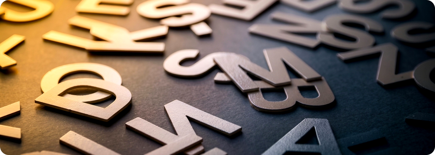
Accessible Typography: Font Choice, Size, Line Height, and Spacing Considerations
If people can’t comfortably read your content, the experience breaks down quickly.
Typography isn’t just visual design. It affects whether someone can actually use what you’ve built. Font choice, size, and spacing all influence readability, comprehension, and fatigue.
This guide focuses on the decisions that make text easier — or harder — to read in real situations.
Font Choice: Prioritizing Readability
Start with clarity. If a font slows someone down, it’s the wrong choice.
- Use simple, readable sans-serif fonts like Inclusive Sans, Atkinson Hyperlegible, Arial, Verdana, Open Sans, Inter, Roboto, or Source Sans Pro.
- Avoid decorative or script fonts. They trade readability for aesthetics.
- Choose fonts where similar characters are easy to tell apart (like “l”, “1”, and “I”).
- Limit your system to one or two fonts. More than that adds unnecessary cognitive load.
Variable fonts can be useful, but only if they maintain clarity across weights and sizes. Flexibility doesn’t matter if readability suffers.
Font Size: Make It Readable by Default
Small text doesn’t look clean — it makes content harder for many people to read.
- Start with at least 16px (1em) for body text. Anything smaller becomes difficult for many users, especially on mobile.
- Use relative units (em, rem) so text scales properly when users zoom.
- Test your layout at different zoom levels. Text should reflow without breaking the experience.
If users consistently need to zoom just to read body text comfortably, readability likely needs improvement.
Line Height: Control Reading Flow
Line height affects how easily someone can move from one line to the next.
- Aim for around 1.5× the font size for body text.
- Too tight → text feels dense and hard to track
- Too loose → lines feel disconnected and harder to follow
Test a few variations side by side. The difference becomes obvious within seconds.
Spacing: Reduce Visual Friction
Good spacing makes reading feel effortless. Poor spacing turns it into work.
- Keep letter spacing close to default. Slight increases can help, but too much can hurt word recognition.
- Ensure enough space between words so they don’t run together.
- Add space between paragraphs (1–1.5em) to make content easier to scan.
If everything feels cramped, users slow down. If it feels disconnected, they lose their place.
Typography isn't just visual design. It affects whether someone can actually use what you've built. Font choice, size, and spacing all influence readability, comprehension, and fatigue.
Character Clarity (Counters & Confusability)
Some characters are easy to confuse, especially at smaller sizes or lower contrast.
Watch for:
- l / 1 / I
- b / d / p / q
- 6 / 9
- c / e
- rn / m
If users have to stop and decode characters, reading becomes harder.
Choose fonts with clear shapes and distinct letterforms. Small differences — like a tail on an “l” or a more open “c” — can make a big difference.
Mirroring
Mirroring, or flipping, happens when a letter or number resembles another when rotated or viewed quickly. For example, someone might see a “b” as a “d,” or a “6” as a “9.” This can make words like “bog” look like “dog.”
Sometimes, letters can also appear transposed. For example, “loin” might look like “lion,” or “lien” might look like “line.”
To reduce these mix-ups, make sure similar letters and numbers are easy to tell apart:
qp
db
0O
nu
il1I
69
a8
a6
6g
rn, m
When choosing a font, especially a sans serif, check how the uppercase “L,” lowercase “l,” and the number “1” appear. These characters are often difficult to distinguish because of their simple shapes. Small details like a tail on the “l” or a serif on the “1” can improve readability.
Some letters are mirror images, like “b,” “d,” “p,” and “q.” Small differences in thickness, spacing, or shape can help distinguish them more clearly.
Links: Make Them Obvious and Predictable
Links shouldn’t require guesswork.
- Make links visually distinct from surrounding text, not just through color. Underlines or other visual cues help.
- Ensure visited links look different so users understand where they’ve already been.
- Use descriptive link text. “Click here” doesn’t provide meaningful context.
- Let users open content in ways that work for them, including opening links in new tabs or downloading files when appropriate.
If users can’t identify or trust a link, they may avoid using it.
Additional Accessibility Considerations
- Contrast matters. Text should clearly stand out from the background (WCAG recommends at least 4.5:1 contrast for normal body text).
- Left-align body text. Justified text can create uneven spacing and reduce readability.
- Avoid all caps for long passages. It can slow reading and reduce comprehension.
- Let users adjust text. Don’t override browser or system settings.
- Avoid putting important text in images when possible. Text inside images is harder to resize, adapt, and access across different environments.
Test in Real Conditions
Typography that looks good in a design file can still fail in real use.
- Test at high zoom (200–400%)
- Test on different screen sizes and resolutions
- Test with assistive technologies like screen readers and magnifiers
- Check readability in difficult conditions like glare, low brightness, or motion
You’ll usually find issues quickly once you move beyond ideal conditions.
Final Thought
Typography isn’t decoration. It’s usability.
If reading your content takes effort, users may stop reading.
Make it easy.