

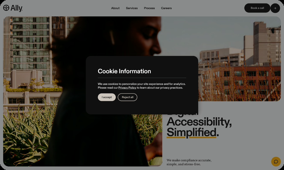
Making Cookie Banners Actually Accessible
Cookie banners are everywhere. They notify users about data tracking and allow them to consent to or decline tracking preferences. They can also become one of the most inaccessible parts of a website.
Most teams focus on legal compliance, making sure the banner meets GDPR, CPRA, or other privacy regulations. But a banner can be legally sound and still be difficult or impossible for some people with disabilities to use, defeating the purpose of user consent altogether.
What's Going On
Cookie banners appear on nearly every commercial website. They're supposed to give users control over tracking and data collection. However, in practice, they often:
- Block content underneath
- Trap keyboard focus
- Create unclear navigation order
- Announce themselves poorly, or not at all, to screen readers
The problem is timing. Cookie banners are usually added late in the development process and often through third-party tools. By the time someone thinks about accessibility, the banner is already live and causing problems.
Where Teams Get Stuck
Most cookie banner issues come from a few common misunderstandings.
“It's a third-party tool, so we can't control it.”
You're still responsible for accessibility, even if you didn't build the component. If the banner creates barriers for users with disabilities, that responsibility still falls on your organization.
Plugins can also make customization difficult. They may create color contrast issues, responsiveness problems, or break when users zoom or adjust text spacing. In some cases, building a custom cookie banner you fully control may be easier than heavily customizing a third-party component.
“Users only dismiss it once, so it doesn't matter if it's hard to use.”
For keyboard and screen reader users, a difficult banner can prevent access to the site entirely. Some cookie banners block interaction with the rest of the page until a choice is made, such as having to opt-in.
This also leads to some banners that only work properly at one viewport size or zoom level, while the layout breaks in others.
“We made the ‘Accept All’ button bigger and more obvious, so it's accessible.”
Encouraging users toward one choice does not improve accessibility. A visually dominant “Accept All” button may make rejecting or customizing preferences harder to find or use.
Accessibility means all options should be equally usable and understandable.
You're still responsible for accessibility, even if you didn't build the component. If the banner creates barriers for users with disabilities, that responsibility still falls on your organization.
How to Think About It Instead
Cookie banners come in all shapes and sizes. Some are simple and easy to understand. Others may be wordy and have ambiguous context or far too many buttons and toggles.
Many cookie banners function like modal dialogs because they interrupt the user’s task and require interaction. That makes them one of the highest-priority accessibility concerns on a site.
The banner should:
- Announce itself clearly when it appears
- Be fully operable with a keyboard
- Provide equal access to all choices (accept, reject, customize)
- Avoid trapping focus indefinitely
- Return focus appropriately when dismissed
Think of it this way: if someone can't get past your cookie banner, they may not be able to use the rest of your website, defeating the point of a website.
Practical Guidance
1. Test the banner with a keyboard first
Before worrying about screen readers, try this:
- Load your site
- Press Tab repeatedly
- Can you reach all buttons in the banner?
- Can you activate each button with Enter or Space?
- Does focus move in a logical order?
- Can you dismiss the banner and continue to the main content?
If any of these fail, you likely have a problem.
2. Check what a screen reader announces
Turn on VoiceOver, NVDA, or TalkBack and load the page.
Questions to ask during testing:
- Is the banner announced as a dialog or alert?
- Does it have a title or heading?
- Are accordions and toggles clearly identified?
- Does it explain what the user needs to do?
- Are all buttons clearly labeled?
- Is the customization option as obvious as “Accept All” or “Reject All”?
The banner should announce something like:
“Cookie consent dialog. This site uses cookies. You can accept all cookies, reject all cookies, or customize your preferences.“
Not:
“Dialog. Button. Button. Button.”
Above all, make sure the cookie banner is announced clearly and one of the first elements the screen reader announces.
3. Ensure focus is managed properly
When the banner appears:
- Focus should move into the banner automatically, or the banner should be the first element in the focus order.
- When dismissed, focus should return to a logical location on the page
Users shouldn't have to hunt for the banner with Tab.
4. Make all options equally accessible
Your banner probably includes:
- Accept All
- Reject All (or “Necessary Only” with what necessary means clearly specified)
- Privacy Policy or Cookie Policy links
- Customize / Manage Preferences
All primary options should receive equal visual treatment and be easy to identify. Text should be clear and easy to understand.
If “Accept All” is a large green button while “Reject All” is tiny gray text at the bottom, that can pressure users toward one choice over another.
5. Test the customization settings too
Many banners include a “Manage Preferences” section with checkboxes for different cookie categories.
Test:
- Can you reach all checkboxes with a keyboard?
- Is it clear which categories are required and which are optional?
- Are checkboxes labeled clearly?
- Can users tell when an option is disabled or unavailable?
- Does the Save button work properly with keyboard and screen reader testing?
Many preference panels use accordions and expandable sections. In practice, these settings screens often have worse accessibility than the main banner itself.
6. Don’t forget mobile and zoom behavior
Cookie banners frequently work on desktop but break down on mobile devices or at higher zoom levels.
Test whether:
- Controls remain usable at 200% zoom
- Buttons are large enough to activate reliably
- Content overlaps or becomes hidden on small screens
- Users can still scroll and interact with the page predictably
A banner that works with a mouse on a large screen may still create barriers on touch devices or smaller viewports.
7. Offer a persistent preferences link
Some users dismiss the banner and later want to change their settings.
Include a “Cookie Preferences” or “Privacy Settings” link somewhere easily accessible, like the footer. This gives users a reliable way to revisit their choices without waiting for the banner to reappear.
What “Good” Looks Like
A well-designed accessible cookie banner:
- Easy to understand what it is and what is required from the user.
- Announces itself properly to assistive technology
- Provides clearly labeled options to accept, reject, or customize
- Works with keyboard navigation
- Manages focus appropriately
- Includes a persistent way to revisit settings later
The banner shouldn’t obscure critical content or create navigation problems. Focus should also remain visible throughout interaction.
Cookie banners aren’t especially complicated, but they do require testing with the tools people actually use.
Most cookie banners fail because no one tested them with a keyboard or screen reader before launch. The legal team reviewed them. The marketing team reviewed them. But no one checked whether someone using assistive technology could actually interact with them.
That’s the difference between compliance and accessibility.