



How to Test Buttons and Links Without Getting Lost in WCAG
Before You Test Anything, Ask One Question
When teams test accessibility, they often focus on individual requirements:
- Does the contrast ratio pass?
- Does it have an accessible name?
- Can it be reached with a keyboard?
These are important questions, but they can sometimes lead to checklist thinking.
A more effective approach is to start by understanding what users need from a button or link. Once that foundation is in place, the technical requirements become much easier to understand.
Ask yourself:
What is this element supposed to do?
That sounds obvious, but it's where many accessibility issues begin.
If selecting an element performs an action, it should be a button.
Examples include:
- Opening a menu
- Submitting a form
- Expanding content
- Launching a modal
If selecting an element takes users somewhere else, it should be a link.
Examples include:
- Navigating to another page
- Downloading a document
- Jumping to another section of a page
Many accessibility problems happen when these roles become blurred or are treated interchangeably.
A link is styled to look like a button. A button is coded as a link. A custom component replaces native HTML and loses built-in accessibility support.
These patterns are common because they often seem harmless, but they can create significant accessibility barriers.
Another challenge is that many teams only test the default state of a component. They verify that it looks good on screen but forget to check what happens when a keyboard user tabs to it, hovers over it, when it becomes disabled, or when it is activated.
Accessibility issues often appear in these states rather than in the default design.
Starting with the right element solves a surprising number of problems before testing even begins.
Three Questions Every Button and Link Should Answer
Rather than memorizing dozens of requirements, start with these three simple objectives:
- Can users find it?
- Can users reach it?
- Can users use it?
Can Users Find It?
Interactive elements shouldn't feel like a guessing game.
Ask yourself:
- Is the label clear?
- Is there enough contrast in all states?
- Is it obvious that the element can be interacted with?
- Is there a visible focus indicator when navigating with a keyboard?
Users should be able to identify interactive elements quickly. They should never have to guess whether something is interactive.
Can Users Reach It?
Not everyone uses a mouse.
Once users find a button or link, they need to be able to interact with it regardless of how they navigate the page.
This includes:
- Keyboard users: They should be able to reach buttons and links using the Tab key.
- Screen reader users: They should be able to understand the functionality of the control.
- Touch users: They should be able to activate controls without accidentally selecting something nearby.
- Users with low vision: They should still be able to identify the control when zooming or increasing text size.
Testing should focus on whether the interaction works for all of these groups.
Can Users Use It?
Once someone finds and reaches the control, can they actually use it?
- Buttons should respond to keyboard interaction.
- Links should be reachable and usable.
- Controls should have a clear, programmatically determinable purpose before activation.
Accessibility isn't just about whether something exists on the page. It's about whether people can successfully complete the task in front of them.
Testing Buttons
When reviewing a button, here are a few things worth checking.
Use a Real Button
Whenever possible, use the native <button> element.
Native buttons already provide much of the accessibility support you need, including keyboard behavior and focus handling.
There are also testing extensions and bookmarklets that identify whether the native element is being used.
Verify the Accessible Name
The visible text, icon, or symbol should clearly communicate what the button does.
The button's programmatic name should contain the visible text. Ideally, the visible label and accessible name are identical.
Avoid relying on color alone to convey meaning. Also avoid adding labels or titles that override or duplicate the button's existing label.
Users of assistive technologies should be presented with one clear button name.
Check Contrast
For WCAG 2.2 AA:
- Normal-sized text requires a contrast ratio of at least 4.5:1.
- Large text requires at least 3:1.
- The visual elements that identify the button, such as borders, backgrounds, or outlines, should also have sufficient contrast of 3:1 against surrounding colors.
If a button uses a gradient background, test against the least contrasting portion of the gradient.
Verify Touch Target Size
Buttons should generally be at least 24 × 24 CSS pixels or meet the WCAG spacing exception.
Tiny buttons may look elegant, but they can be frustrating for touch users. This helps users who have limited dexterity, use touch devices, or have difficulty selecting small targets.
Test Keyboard Access
Native buttons should:
- Receive focus
- Activate with Enter
- Activate with Space
If they don't, something is probably wrong.
Check the Focus Indicator
A keyboard user should always be able to tell where they are on the page. If the focus indicator disappears, navigating becomes much harder.
Avoid removing the browser's default focus indicator unless you replace it with something equally visible.
Use a highly visible focus indicator with strong contrast. A focus indicator should maintain at least a 3:1 contrast ratio against both the default component state and surrounding colors.
A thicker focus indicator is generally easier to see, particularly for users with low vision.
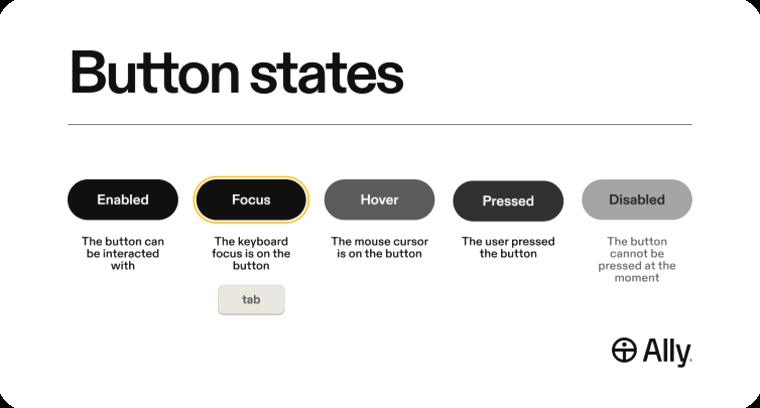
Test All States
Many accessibility issues don't appear in the default design.
Other states to check:
- Default
- Hover
- Focus
- Active
- Disabled
Some of the most common issues hide in states that rarely receive attention during design reviews. For example, a button may pass contrast requirements in its default state but fail when the text color changes on hover.
A Quick Link Check
Links deserve the same level of attention.
Use a Real Link
For standard web navigation, links should generally use an <a> element with an href attribute for native link behaviour.
If the interaction takes users somewhere, it should be a link.
Make the Destination Clear
Link text should clearly communicate where the user will go.
Avoid generic labels such as:
- Read More
- Learn More
- Click Here
Instead, include meaningful destination information within the link text.
Imagine hearing the link out of context. Would it still make sense?
- ❌ Read More
- ✅ Read More About Accessibility Testing
Ensure Links Are Visually Identifiable
This is especially important for inline links.
Users should be able to distinguish links from surrounding text.
Underlines remain one of the most reliable visual cues. If links are identified primarily through color, additional WCAG requirements may apply.
Check Keyboard Accessibility
Links should:
- Receive keyboard focus
- Display a visible focus indicator
- Activate with Enter
Review Linked Images
As a best practice, avoid using images as links. It causes accessibility issues as well as SEO issues due to the lack of written text. However, if an image is the only content inside a link, its alt text should clearly communicate the link's destination or purpose.
If the image is decorative and accompanied by text, the image can usually have empty alt text.
If an image sits inside a link or button that already contains visible text, avoid duplicating that text in the image alt text, as this can create repetitive announcements for assistive technology users.
Inform Users About New Tabs
If a link opens a new tab or window, let users know in the visible link text or accessible name.
Unexpected behavior can be disorienting, particularly for some assistive technology users.
Consider Skip Links
When pages contain repeated navigation or other repeated content, provide a skip link that allows keyboard users to jump directly to the main content.
As a best practice, the skip link should generally be the first focusable element on the page.
However, skip links should only be used when there is repetitive content to bypass. If no such content exists, a skip link may create unnecessary complexity.
A Few Nice-to-Haves
WCAG 2.2 AA establishes the baseline, but some additional improvements can make interactions even easier.
Consider:
- Highly visible focus indicators with a minimum 3:1 contrast ratio and approximately 2px thickness
- Avoiding icon-only buttons when possible
- Providing visible close buttons for dialogs
- Larger target sizes of around 44 × 44 CSS pixels
- Indicating external websites visually
- Avoiding duplicate announcements from linked images and text
- Avoiding situations where assistive technologies announce the same information multiple times
These aren't always required, but they often make websites more usable and create a better overall experience.
One Final Thought
When testing buttons and links, it's easy to get lost in individual requirements.
Just ask yourself three simple questions:
- Is it the right element?
- Can users find it?
- Can users use it?
If the answer is yes to all three, you're already well on your way to creating a more accessible experience.
The technical requirements still matter. But when teams focus on the user experience first, accessibility becomes much easier to understand, test, and maintain over time.